Heatmap Configuration
Overview
The Risk Heatmap Configuration feature allows organizations to customize how risks are visualized and categorized within the Heatmap Chart. It provides flexibility to define axis orientation, likelihood and severity buckets, risk zones, colors, and risk level assignments based on the organization's risk assessment methodology.
Using this configuration, administrators can control how risk scores are mapped, how different risk levels are displayed, and how risk concentrations are represented in the Heatmap. The configuration page also includes a live preview, enabling users to validate changes before applying them.
- Log in to your Data Governance Tool account.
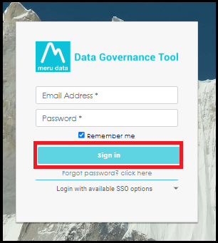
- From the hamburger menu present on the top left corner of the Dashboard, click on Risk Register.

Heatmap Chart
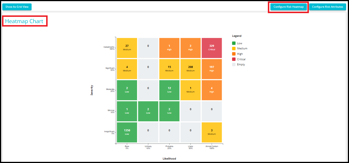
When you open the Risk Register module, you are directed to the Heatmap Chart page. The Heatmap Chart provides a visual representation of risks based on their Likelihood and Severity ratings.
Each cell displays the number of risks that fall within that particular Likelihood--Severity combination. This allows users to quickly identify where risks are concentrated and prioritize mitigation efforts accordingly.
The chart helps users quickly identify:
Which risks require immediate attention.
The distribution of risks across different risk levels.
High-risk and critical-risk areas within the organization.
Trends and concentrations of risks based on configured risk assessment criteria.
Configure Risk Heatmap
- Click the Configure Risk Heatmap button located in the upper-right corner of the page to customize how risks are displayed in the Heatmap Chart.
Note: Access to the Configure Risk Heatmap page is permission-based. Only users with the appropriate permissions can configure and save Heatmap settings. Users without the required permissions will not be able to modify the Heatmap configuration.
This opens the Configure Risk Heatmap screen, where you can define how risks are visualized within the Heatmap.
The configuration page allows you to customize: Axis Configuration, Likelihood Buckets, Severity Buckets, Risk Zones & Colors, Matrix Configuration.
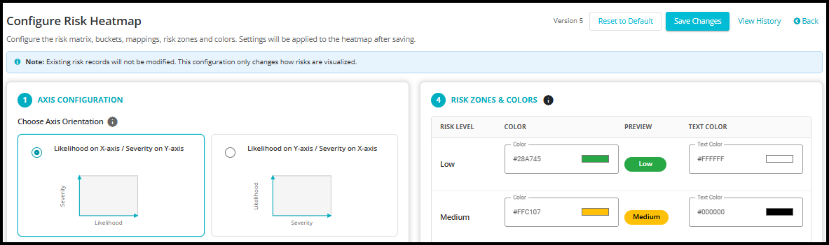
Note: Existing risk records will not be modified when you update the Heatmap configuration. These settings only affect how risks are visualized and categorized within the Heatmap Chart.
The underlying risk data, risk scores, and risk register records remain unchanged. Any changes made to axis configuration, buckets, risk zones, colors, or matrix mappings are applied only to the Heatmap display after saving the configuration.

1. Axis Configuration
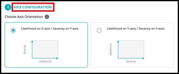
The Axis Configuration section allows you to define how Likelihood and Severity are displayed in the Heatmap, customize the axis titles, choose how bucket values are displayed, and control the visual intensity of Heatmap cells.
Choose Axis Orientation - This setting determines how the Heatmap axes are arranged.
Likelihood on X-axis / Severity on Y-axis
Select this option to display:
Likelihood horizontally (X-axis)
Severity vertically (Y-axis)
This is the most commonly used Heatmap layout, where the probability of occurrence increases from left to right and the impact increases from bottom to top.
Likelihood on Y-axis / Severity on X-axis
Select this option to display:
Likelihood vertically (Y-axis)
Severity horizontally (X-axis)
This option is useful when your organization prefers to evaluate risk with impact increasing from left to right and probability increasing from bottom to top.
Axis Titles - The Axis Titles fields allow you to customize the labels displayed on the Heatmap axes.
These titles help align the Heatmap terminology with your organization's risk management framework.

Bucket Display Format - This setting controls how bucket values are displayed in the Heatmap.

Show Percentage (%) - Displays bucket values as percentages.
This option is useful when risk assessment is based on percentage-based probability and impact ranges.
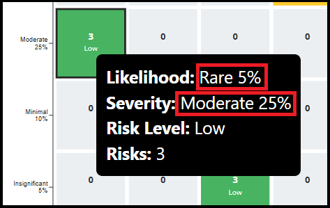
Show Numbers Only - Displays only numeric values without percentages.
This option is commonly used when organizations use a numerical scoring model.
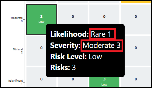
Custom Text - Allows you to define custom labels for each bucket.
This option provides the greatest flexibility and allows organizations to use business-specific terminology.
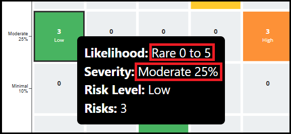
Note: The Heatmap supports 5 Likelihood and 5 Severity buckets by default. However, you can configure a minimum of 3 buckets and a maximum of 8 buckets for each axis depending on your risk assessment requirements.
Vary Intensity by Count - This toggle controls whether the color intensity of a Heatmap cell changes based on the number of risks contained within that cell.
When enabled:
Cells containing a higher number of risks appear with a stronger or darker color intensity.
Cells containing fewer risks appear with a lighter intensity.
This helps users visually identify areas where risks are highly concentrated.
When the toggle is enabled, the Min Opacity and Max Opacity fields become available.
Min Opacity
This value defines the minimum color intensity that can be applied to a Heatmap cell.
Cells containing fewer risks will use an opacity value closer to the configured minimum.
Lower values produce lighter shades of the selected risk zone color.
Max Opacity
This value defines the maximum color intensity that can be applied to a Heatmap cell.
Cells containing the highest concentration of risks will use an opacity value closer to the configured maximum.
Higher values produce darker and more prominent colors.
When disabled:
- All cells within the same risk zone use the same color intensity regardless of the number of risks they contain.

2. Likelihood Buckets
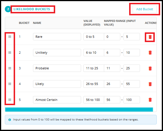
The Likelihood Buckets section is used to define how the system categorizes the probability of a risk occurring. Each bucket represents a likelihood level and is mapped to a specific input value range.
Bucket - The Bucket column displays the sequence number of each likelihood bucket.
The bucket order determines how likelihood values are displayed on the Heatmap axis.
Name - The Name field allows you to define the label displayed for each likelihood level.
Organizations can rename these values to match their internal risk assessment framework.
Value (Displayed) - This field shows the range that will be displayed to users for the bucket.
These values help users understand the probability range associated with each likelihood level.
Mapped Range (Input Value) - This fields determine which input values are assigned to each bucket.
Note: Input values from 0 to 100 are automatically mapped to the configured likelihood buckets based on the ranges defined for each bucket.
Example
Suppose a risk assessment assigns a likelihood score of 32.
Based on the configuration:
Range Bucket
0-5 Rare
6-10 Unlikely
11-25 Probable
26-55 Likely
56-100 Almost Certain
The score 32 falls within the range 26--55, so the risk is automatically assigned to the Likely bucket and displayed accordingly on the Heatmap.
This configuration provides flexibility to align likelihood scoring with your organization's risk assessment methodology while ensuring that risks are consistently categorized and visualized.

Add Bucket
Click Add Bucket to create a new likelihood bucket.
This is useful when your organization requires more detailed likelihood categorization.
NOTE: The Heatmap supports a maximum of 8 likelihood buckets.
Reorder Buckets
Use the drag handle (≡) on the left side of each row to rearrange bucket order.
This allows you to change how likelihood levels appear on the Heatmap axis.
Delete Bucket
Click the Delete icon to remove a likelihood bucket.
Use this option carefully, as modifying bucket ranges can affect how risks are categorized in the Heatmap.
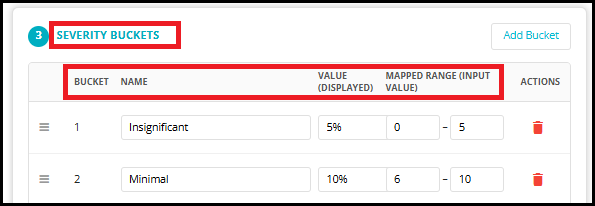
3. Severity Buckets
The Severity Buckets section is used to define how the system categorizes the impact or consequence of a risk if it occurs. Each bucket represents a severity level and is mapped to a specific input value range. These buckets are displayed on the Heatmap axis and determine where risks are positioned based on their impact rating.
Bucket - The Bucket column displays the sequence number of each severity bucket.
The bucket order determines how severity levels appear on the Heatmap axis.
Name - The Name field allows you to define the label displayed for each severity level.
Organizations can rename these values to match their internal risk assessment framework.
Value (Displayed) - This field shows the range that will be displayed to users on the Heatmap.
These values help users understand the impact level associated with each severity bucket.
Mapped Range (Input Value) - This fields determine which severity scores are assigned to each bucket.
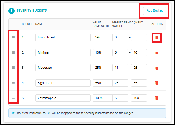
Note: Input values from 0 to 100 are automatically mapped to the configured severity buckets based on the ranges defined for each bucket.
Add Bucket
Click Add Bucket to create a new severity bucket.
This option is useful when your organization requires more detailed impact categorization.
NOTE: The Heatmap supports a maximum of 8 severity buckets.
Reorder Buckets
Use the drag handle (≡) on the left side of each row to rearrange bucket order.
This allows you to change how severity levels appear on the Heatmap axis without modifying the underlying risk data.
Delete Bucket
Click the Delete icon to remove a severity bucket.
Use this option carefully, as changing severity ranges can affect how risks are categorized and displayed in Heatmap.
4. Risk Zones & Colors
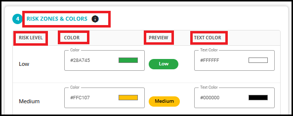
The Risk Zones & Colors section allows you to define the visual appearance of each risk level displayed in the Heatmap.
NOTE: These colors are used throughout Heatmap, including the Heatmap cells, legends, and preview. This helps organizations align risk visualization with their internal risk management standards and make risk levels easier to identify at a glance.
Risk Level - The Risk Level column displays the configured risk zones.
These risk levels are later assigned to Likelihood--Severity combinations through the Matrix Configuration.
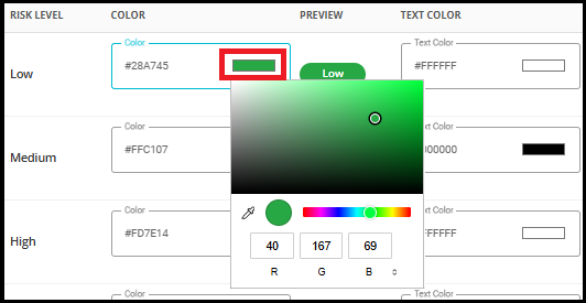
Color - The Color field allows you to configure the background color used to represent each risk level in the Heatmap.
You can enter a custom color code or select a color that aligns with your organization's risk visualization standards.
Preview - The Preview column displays a sample representation of how the selected risk level will appear in the Heatmap using the configured background and text colors.
This allows you to validate appearance before saving the configuration.
Text Color -- This field allows you to configure the color of the text displayed within the Heatmap cells.
This helps ensure that labels remain readable regardless of the selected background color.
5. Matrix Configuration (Risk Zone Assignment)
The Matrix Configuration section is used to define how risk levels are assigned based on the combination of Likelihood and Severity values.
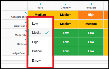
Once the Likelihood Buckets, Severity Buckets, and Risk Zones have been configured, the Matrix allows you to map each Likelihood--Severity combination to a specific risk level such as Low, Medium, High, or Critical. This mapping determines the color and risk rating displayed in the Heatmap.
How the Matrix Works
The matrix consists of:
Likelihood values displayed horizontally across the top.
Severity values are displayed vertically along the left side.
Each cell represents a unique combination of Likelihood and Severity.
Each cell is assigned to a Risk Zone (Low, Medium, High, or Critical).
When a risk is assessed, the system identifies:
The appropriate Likelihood Bucket.
The appropriate Severity Bucket.
The corresponding matrix cell.
The Risk Zone was assigned to that cell.
The risk is then displayed in the Heatmap using the configured color for that Risk Zone.
Example
Consider a risk with:
Likelihood: Almost Certain
Severity: Catastrophic
Looking at the matrix, the intersection of Almost Certain and Catastrophic is assigned to the Critical risk level.
Therefore:
The risk will be categorized as Critical.
The Heatmap cell will use the configured Critical color.
The risk count will be displayed in the Critical zone.
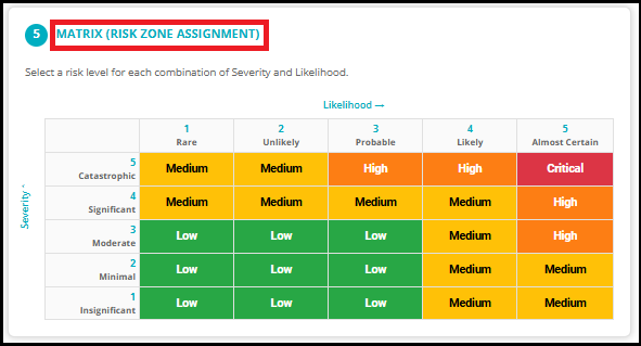
Each matrix cell can be configured independently.
This flexibility allows organizations to align the Heatmap with their internal risk appetite, risk tolerance, and governance framework.
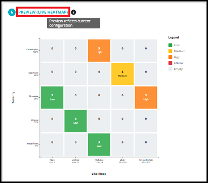
6. Preview (Live Heatmap)
The Preview (Live Heatmap) section provides a real-time visualization of the Heatmap based on the current configuration settings. It allows you to immediately see how the Heatmap will appear after applying your configuration changes.
The Preview displays:
The configured Likelihood axis.
The configured Severity axis.
Risk Zone assignments from Matrix Configuration.
The colors are configured for each risk level.
The legend shows all configured risk zones.
Sample risk counts displayed within Heatmap cells.
This gives you a complete representation of how the final Heatmap will appear to users.
The Preview helps you:
Verify that bucket names and ranges are displayed correctly.
Confirm that risk zone assignments match your organization's risk methodology.
Validate color selections and text readability.
Ensure the overall Heatmap layout is easy to understand before saving.
Identify configuration issues before they affect users.
The preview reflects the current configuration. Any changes made to buckets, colors, axis orientation, or matrix assignments are displayed immediately in the Preview. However, these changes are not applied to the actual Heatmap Chart until you click Save Changes.
Reset to Default - This button allows you to restore the Heatmap configuration to the system's default settings.
Use this option when:
You want to discard all unsaved customization changes.
You want to revert to the default Heatmap structure provided by the system.
The current configuration is no longer suitable, and you want to start again using the default settings.
Note: Resetting to default only updates the configuration currently displayed on the screen. The actual Heatmap is not updated until you click Save Changes. If you leave the page without saving, the existing Heatmap configuration remains unchanged
Save Changes - After configuring the Heatmap, click Save Changes to apply the configuration.
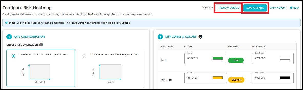
Version Number
The Version indicator shows the version number of the currently active Heatmap configuration.
Every time the Heatmap configuration is saved, a new version is created. This allows organizations to maintain a history of configuration changes and track how the Heatmap has evolved over time.

View History
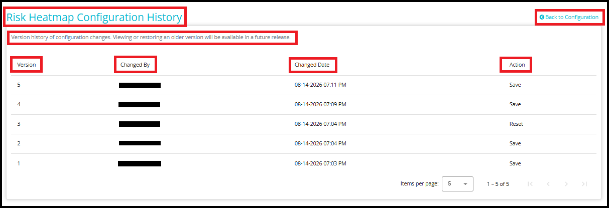
Click View History to open the Risk Heatmap Configuration History page.
The history page provides an audit trail of all Heatmap configuration changes and displays the following information:
Version - The version number of the Heatmap configuration.
Changed By -- Displays the user who performed the action on the Heatmap configuration.
Changed Date -- The date and time when the action was performed.
Action -- The action performed, such as Save or Reset.
Back to Configuration - Click Back to Configuration to return to the Heatmap Configuration page.
Future Improvements
Note: Version comparison, viewing detailed differences between versions, and restoring previous versions are planned for a future release. Currently, the Version History page is available only for viewing the list of configuration versions and their associated change information.